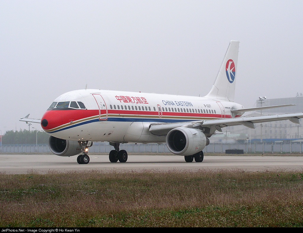
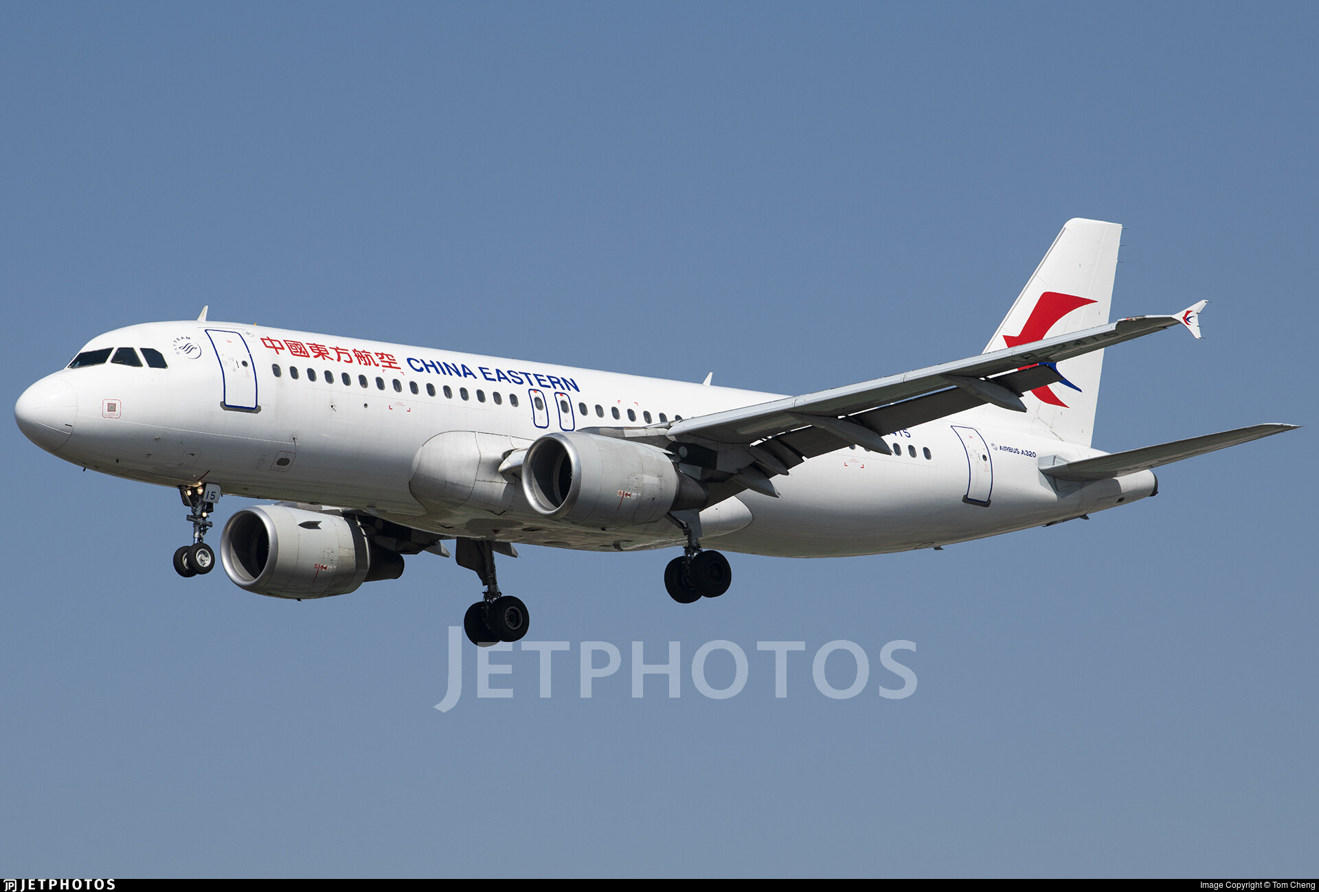
Oh no
Lufthansa is also a pretty bad one
Out of likes
And the airline that doesn’t care about delays, the legendary and famous Tunisair
From this:
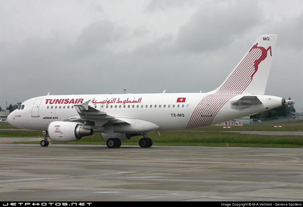
Source
To this:
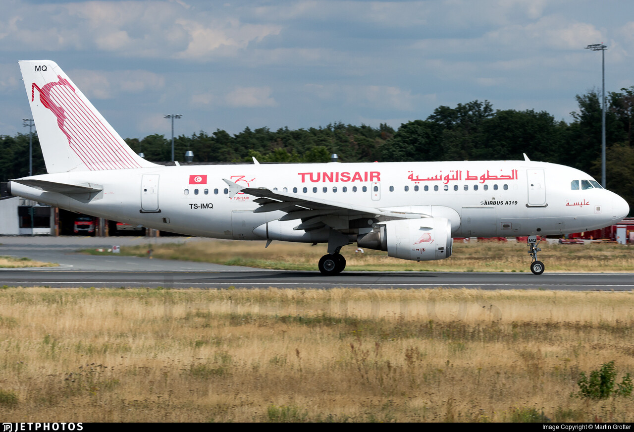
Source
(Expect the “TUNISAIR” font)
Spirit, we went from a rainbow to a literal post-it note
ah yes the banana buses
American went from cool silver chrome to eurowhite.
nah it’s grey tho
Same thing, doesn’t catch the eye imo
TuNiLate you mean
the tail is pretty cool tho
Air Canada new livery just OH NO
I love toothpaste
oh so ur a fellow toothpaste lover, great
The new one… An unwelcome change to say the least.
That Indian one with “go first”
GoAir literally went from bad to worse
The Thomas Cook one too (now Sunclass)
This topic was automatically closed 90 days after the last reply. New replies are no longer allowed.