Errigal
December 9, 2020, 11:02pm
1
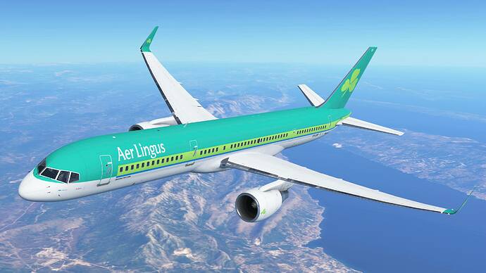
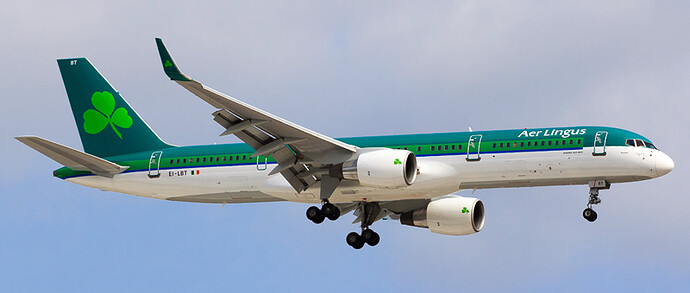
This could be considered a fact but anyway. I’m really happy with the update but the new Aer Lingus livery is just so cheap and corny looking. It looks too bright and he font is stretched and so wrong. I made a video of this which is linked below. Check out and compare
Infinite Flight
Real Life
Video: https://youtu.be/2rztBAXpmDQ
Don’t hate on me please. I’m just pointing this out and I respect the devs fully and great job to them for getting 20.3 ready so well!
1 Like
I notice it, but it’s still beta and they are still making fixes
2 Likes
Oh wow. That’s too light, maybe it will get fixed soon
1 Like
Errigal
December 9, 2020, 11:05pm
5
True just putting out there. I mean no harm
1 Like
Errigal
December 9, 2020, 11:05pm
6
I’ll see if a mod moves it and I’ll know for later. I did stick in a video and 2 photos so I thought this category would be ideal.
1 Like
Errigal
December 9, 2020, 11:08pm
7
Thanks @Zach for changing it. I’ll know for future.
1 Like
Settle down, let’s not dump on IF. Continue the conversation here:
Flight Simulators
Infinite Flight
Infinite Flight 20.3 Tracking Thread Although there will be no IF devs here, we would like to open up this spot for you do discuss about the new 20.3 update from infinite flight. They have released a video today, which is also linked. Feel free to...
Reading time: 8 mins 🕑
Likes: 119 ❤

