Hello all, I took the liberty of creating some graphs for you all
I will try to update this thread with even more interesting charts and data
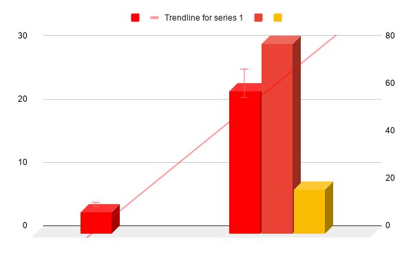
This chart shows the number of mods (on the left) to the user chart (Active, All, and Regulars)
The ratio is about 3:1 with actives, and 6:1 to all users
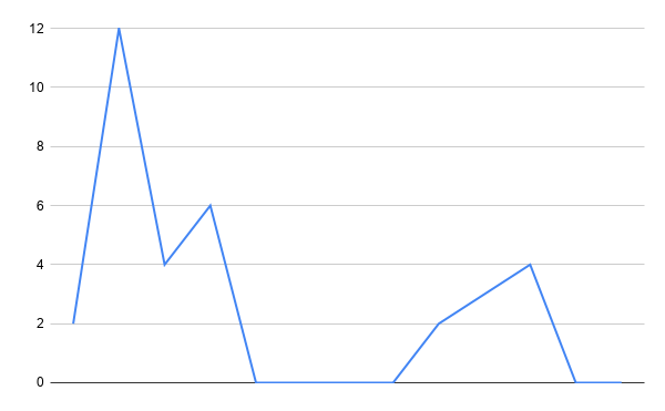
this is the growth of the WFC on users with trackable IP’s.
Don’t fret! this doesn’t mean the WFC is falling, these are new users, so on the contrary it’s actually rising!
That’s all the graphs I have for you now (making one now), feel free to make some below or show me some cool stuff to plot. Thanks!
6 Likes
Beautiful charts and info!
1 Like
Pretty impressive, to be honest. I think we may need to add “Graph Expert” to your name.
2 Likes
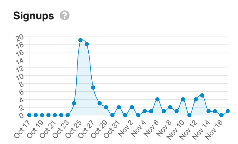
Your sign-up chart is actually quite accurate, by the way. The peak is slightly different as not all IP addresses are traceable, but for the information you have, it’s not far off!
3 Likes
Heads up, new chart!
Alt:
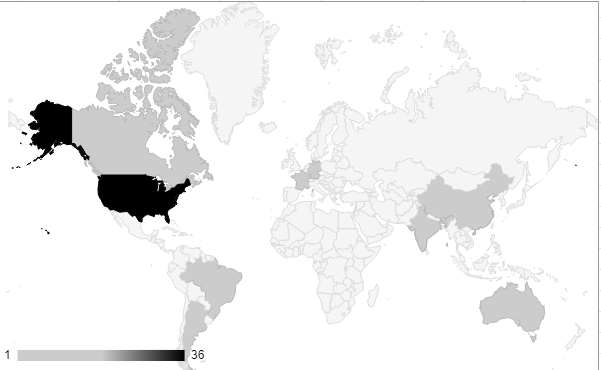
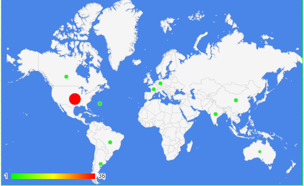
I was making a good Geo chart, but that went as well as you would expect.
1 Like
Thanks Didn’t have all the data tho
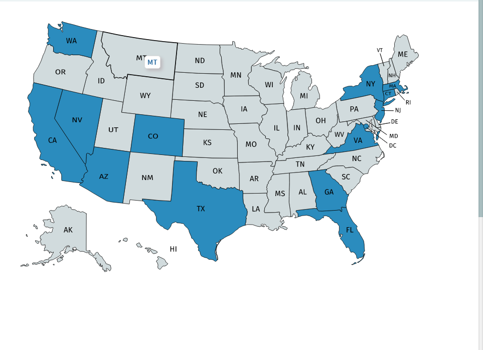
You should do one of these by state! (if possible)
1 Like
Yes, I could (potentially), I lll work on it
1 Like
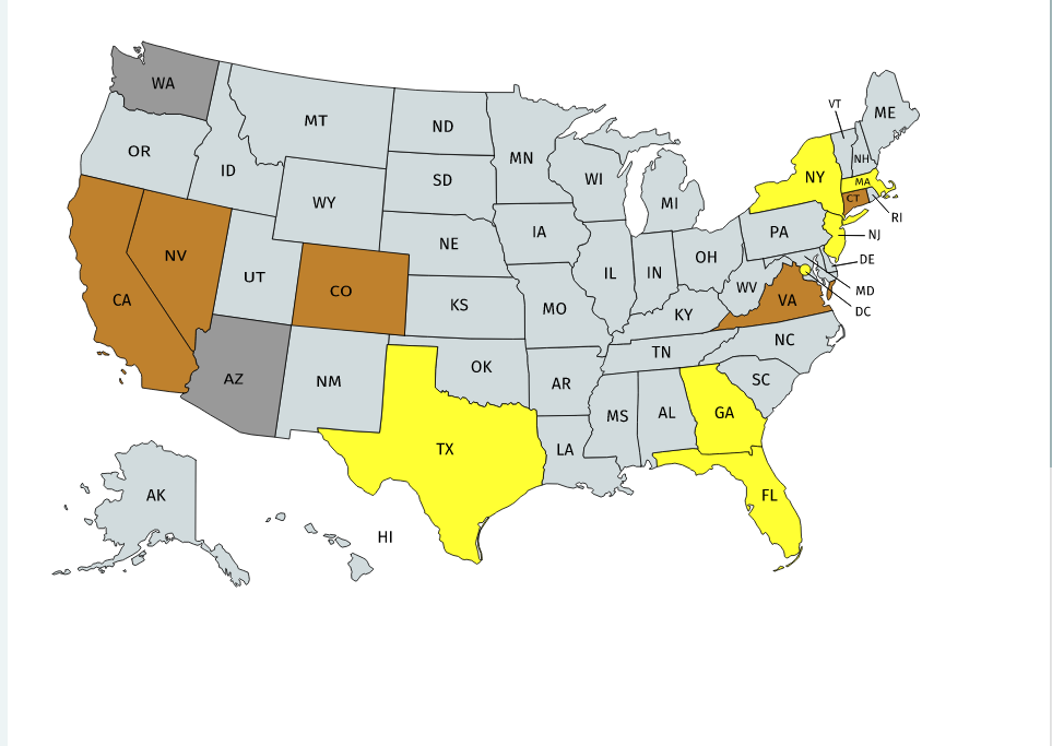
After ages of hot fixing (and mostly taking other stuff from Stack) I have done it
Keep in mind if you don’t see your state that’s because i don’t write good code and probably missed yours (or was to lazy to find you IP)
This one is on TL, pretty self-explanatory.
4 Likes
Wait… I’m very confused which moderator is from Massachusetts?
Toaster said he is from Massachusetts and DC
1 Like
Oh, right… forgot about that
1 Like
system
February 26, 2021, 2:05am
18
This topic was automatically closed 91 days after the last reply. New replies are no longer allowed.