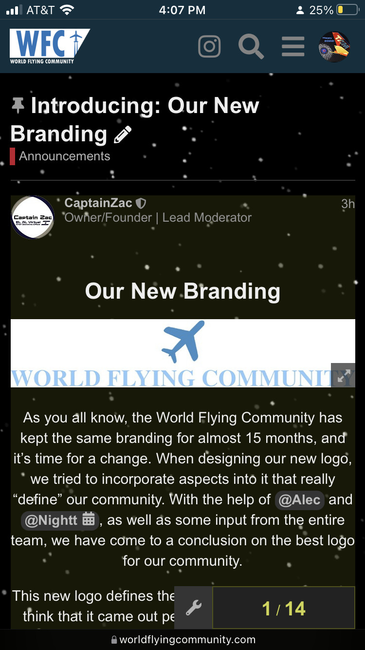
Introducing: Our New Branding

Our New Branding

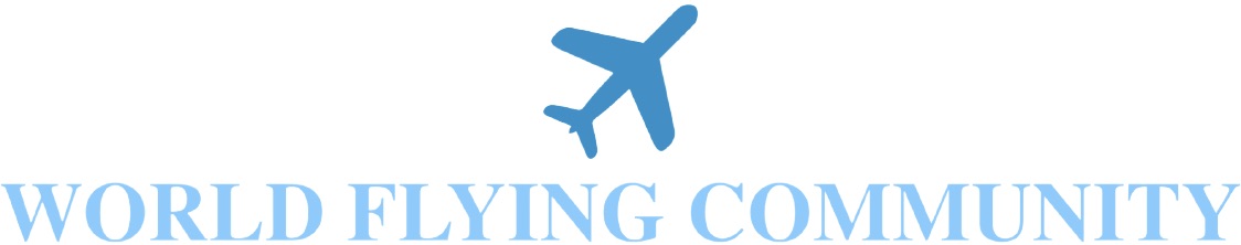
As you all know, the World Flying Community has kept the same branding for almost 15 months, and it’s time for a change. When designing our new logo, we tried to incorporate aspects into it that really “define” our community. With the help of @Alec and @Nightt, as well as some input from the entire team, we have come to a conclusion on the best logo for our community.

This new logo defines the start of the new year, and I think that it came out perfect. I hope you all like it, and it will be replacing all of our other logos very soon!

16 Likes

ooooo no more Times New Roman and generic plane logos! This is a long needed rebranding!

1 Like

I love the new look! Can’t wait to see it get implemented.

2 Likes

brilliant @CaptainZac

1 Like

Good job @Alec and @Nightt!!

4 Likes

It looks spectacular! Well done to everyone who worked on it!

5 Likes

HR, line 1, JWA is calling

In all seriousness, logo looks sleek

2 Likes

Glad I said something about this Lmao I like the new look.

2 Likes

Thank you all! I was the motivational support and telling Alec whether Zac would like it or not.

4 Likes


Looking good!

1 Like

Well, I just got here, but from what I saw when I first joined, this does look a lot better.

2 Likes

I don’t like it, sorry.

3 Likes

Beautiful

1 Like

Not a big fan of it, but certainly better than the old look.

3 Likes

Well I’ve been here for only twelve hours so, I’m fine with a change. I’ll look awesome! @CaptainZac

4 Likes

Are you thinking of adding the new look into other themes (such as dark) Zac?

Bcuz tbh I quite like it

1 Like

Eh, some people don’t like it

1 Like

For me it’s certainly better than the old one

1 Like

It will be added into dark when initial tests are conducted in light mode first.

1 Like